Robert Ryman at Dia:Chelsea

20160210_130125

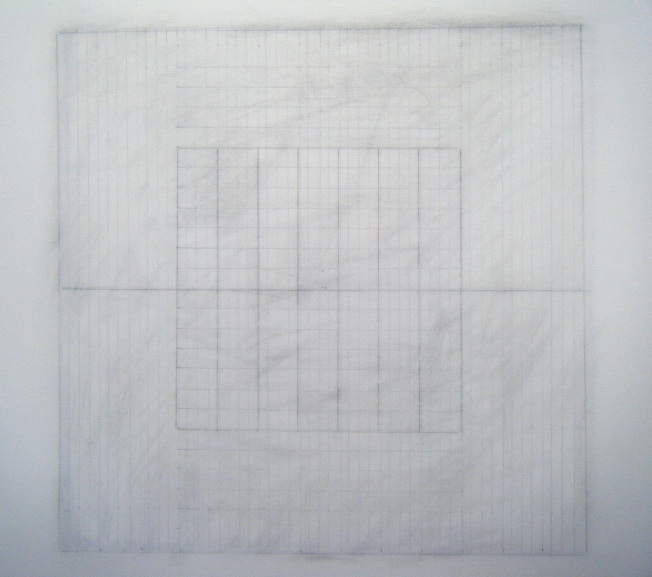
Robert Ryman, Catalyst lll 1985

An exhibition showing a wide range of Robert Ryman’s paintings occupies two large gallery spaces at Dia:Chelsea in New York. My visit to look at his beautiful work was on a grey and freezing wintery day in February. Vittorio Colaizzi quotes Ryman in an essay that introduces a collection of critical writings concerning his art, Ryman: ‘Painters paint in all kinds of ways, but I think that all painting is about enlightenment and delight and wonder’. (Originally published in Robert Ryman, ‘On Painting’, in Christel Sauer and Urs Rasmuller, 1991). In an interview with Ryman in September 2002, the artist who was then approaching his eightieth birthday, described a collector placing one of his paintings in the dark hallway of his home. Deprived of the light and space it needed, Ryman reflected ‘But it’s odd that they seemingly like the painting but yet they don’t understand what it is. Or how it works.’ (Robert Ryman, Critical texts since 1967, ed. Vittorio Colaizzi and Karsten Schubert, Ridinghouse, 2009: 20).
His paintings intrigue me in that on the one hand when faced with walls of mostly white paintings I experience quietude, but when drawing close I am fascinated by the marks and surfaces and his seemingly endless capacity for experimentation. In the Dia show I was particularly drawn to one work, so much so that after leaving the gallery I went back after a while to look again. This work seemed to me to be perfect in its simplicity and slight detail. After an earlier showing of Catalyst III (1985), Ryman spoke of this work, which is an aluminium support held to the wall by four bolts:
‘It’s one of my favourite drawings, that was shown at the Modern, in Bernice’s show (MOMA, New York). It’s not very large 23 x 23 inches, but it’s probably my favourite drawing. It’s just one of these things that is so amazingly simple, but it’s very complex and everything works…What you’re not seeing in the photograph is this line [the aluminium edge of the drawing]. It’s just the line of the metal, but it’s there and it’s important’.
Sharon Phelps: recent work on paper

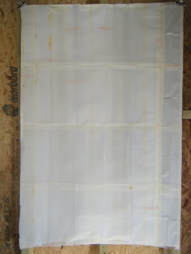
Sharon6The ‘Constructions’ series made in 2013 consists of taped and glued paper; compositions arrived at by a process of reconfiguration and editing – they are residues of the process of making. Folded, torn and cut, they are selected and positioned. A dialogue takes place between the works in progress as sections are removed, interchanged and layered. This process is not hidden from the viewer, who is able to re-interpret the narrative of the making procedures.

These compositions do not refer to anything that exists in the real world. Loosely based on the grid and the possibilities it offers for re-invention, they move beyond tight geometric forms to play with our perception of scale and our understanding of where the edges may be. Small compositions sit within larger pieces. The eye picks up primary elements quickly, but is rewarded by prolonged looking as smaller or slighter details become apparent. It is hoped that the meditative nature of making the work is communicated to the viewer. Sharon3

Sharon4

Joanna Phelps

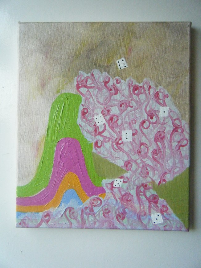
Joanna18There is a strong sense of theatricality in Joanna Phelps’ drawings and paintings. Elements are suspended or balanced within a vertiginous space; often at tipping point or actually falling. The compositions are playful and are a celebration of colour. Recurring motifs in the paintings include small dots of colour that heap and spill like juggling balls, piano keys, kites and multi-coloured twisted threads or ropes. The coloured dots could also be a myriad of small lights. Odd shapes behave like anchors in the picture plane, keeping the tilted compositions in place. There is often a feeling of implied movement, in spaces where the viewer is left reeling and trying to find stability. Floors are never completely horizontal – small rooms hold furniture which could slide away. As if entering a wonky house in a funfair, the viewer feels their way through the space in a strange trajectory while grasping any fixed points if they exist.

Drawing inspiration from diverse sources that include curtained stages and performances by the circus troupe Cirque de Soleil, it is hard to find artists to whom this work relates. Yet it can be encountered in the finely balanced sculptural and filmic compositions of Marijke van Warmerdam and the colourful abstract paintings of Thomas Nozkowski. Although not emulating them in any way, associations can be made between Joanna’s lines of thought and the playfulness and delicately balanced elements in those works. The stage sets could equally be imaginary places. Joanna references Italo Calvino’s ‘Invisible Cities’, in which a city such as ‘Diomira’ has “sixty silver domes” and “multi-coloured lamps…lighted all at once”. Having graduated from the Royal Academy School of Arts, London in 2008, Joanna has shown her paintings in the UK and internationally.
Joanna10Joanna13

Concealment: The Hidden Image

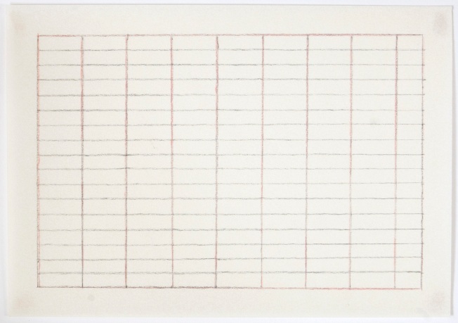
I have recently been drawing grids in pencil, which are then lightly erased.  The lines are fragile and delicate – parts have disappeared and remain only in ghost-like form.  They are drawn on semi-transparent Ingres paper with lines imprinted within it.  The drawing is polished with tissue, leaving a soft surface sheen.  They are hidden images; a secret language imprinted into the paper surface.

In the British Museum there are some wonderful examples of Chinese Porcelain from the time period around AD 1403- 1424.  The bowls have intricate designs; sometimes flowers, and often dragons with wispy clouds.  The bowls are white or yellow; the image pressed into the porcelain beneath a clear glaze in what is called the Anhua technique (meaning hidden image or secret language).  The designs can only be seen when the bowls are held up to the light. In the display cases the images are visible in parts where the light reflects on them.

The hidden image occurs often in painting.  Sometimes as Pentimenti – literally meaning that the painter has ‘repented’ and painted over an original image.  These can be revealed by scientific means in the case of old masters.  Or the hidden image can be deliberate.  It may form an underpainting or drawing which provides structure for a subsequent painting or it may be integral, revealing itself in parts through the upper glazes of paint.  Transparency and layering are useful methods that the painter can employ, adding depth to the surface.

Agnes Martin has drawn grids beneath layers of gesso or acrylic paint.  Callum Innes has marked out vertical lines beneath a painting with a transparent orange glaze, on which constellations of loosely placed dots float.  I have seen an image of one such painting – it holds incredible beauty.  Richard Tuttle, an artist who was close to Agnes Martin, has described her use of colour as ‘tender’.  I think this can also be applied to the application of paint and the drawn line in the work of both Agnes Martin and Callum Innes.

Clouds: Perhaps Agnes Martin’s paintings are like clouds?

grid: graphite and pink pencil on parchment 2012Clouds

The number of forms which clouds may take is almost infinite, but for purposes of description it is necessary to adopt some kind of classification, though whatever classification is used there must at times be border-line cases when a cloud seems to fall half-way between two classes and perhaps belong to neither.

The systems of classification which have been proposed have sometimes been based on the observed appearance of the cloud and at other times on the supposed method of formation.  There can be no doubt that the former is the correct method since an observer is able to judge definitely of the appearance while the method of formation of a given cloud must be to some extent a matter of opinion.

The Meteorological Glossary, Air Ministry Meteorological Office, 2nd edition, 1930

I have been looking at Agnes Martin’s paintings.  They are similar in a way to clouds: her paintings are delicate with diffused colour.  Although there is a guiding principle in their creation, they cannot be the same as each other.  It is true that she drew horizontal lines or grids, but they are not rigid geometric forms.  The pencil lines are lightly drawn across the canvas and are broken by the uneven surface.

The paintings are light – very light.  They are so light that it is hard to capture them in a photograph.  The paint is brushed thinly in lots of pale brushstrokes, which gives a dappled effect.  Or, there are washes of uneven translucent paint.  Agnes Martin painted the bands of colour in a vertical position on the canvas and then turned the painting so that the bands were horizontal.

The colours are not quite contained within the pencil lines.  Sometimes they spill over slightly and often the lines do not quite reach the edge of the canvas.  The lines frame the delicate colours and hold the thin washes in rhythmic bands.  Early grid paintings of the 1960s have a denser mesh of lines.  Later paintings of the eighties and nineties by comparison are more open with a lot of space between the lines.

I recently drew a small grid in graphite pencil on translucent parchment and then drew over it carefully with a pale pink pencil.  The pink lines did not always cover the grey graphite lines, and the pink was not easily visible when it was on the grey lines.  It was intermittent.  Then I went to see Agnes Martin’s painting Morning (1965), and there were grey pencil lines drawn in a grid format with pink pencil lines in the same irregular way, the same intermittent colour.

This grid was a six foot square painting.  Seen on this scale, the mesh of pencil lines formed a soft haze.  Perhaps Agnes Martin’s paintings are like clouds?

Pale   Thin   Vaporous

Striated

Dappled

Haze